
Quantifying the Tier List
We've released three Power Rankings now, and since the beginning we have struggled with how to present the data in a way that surfaces the most important distinctions between the models. Unlike most benchmarks that report only pass/fail for each task, we report Score (pass count adjusted by how many tries it took), Cost, and Latency.
Cost and latency have always mattered–and with the top models converging on perfect pass scores, they are even more important to distinguish between models of similar raw intelligence–but it's notoriously difficult to visualize three dimensions at once. 3D charts are terrible, and radar charts aren't much better. So we've mostly settled for visualizing two at a time, with the Tier List capturing a coarsely quantized version of all three.
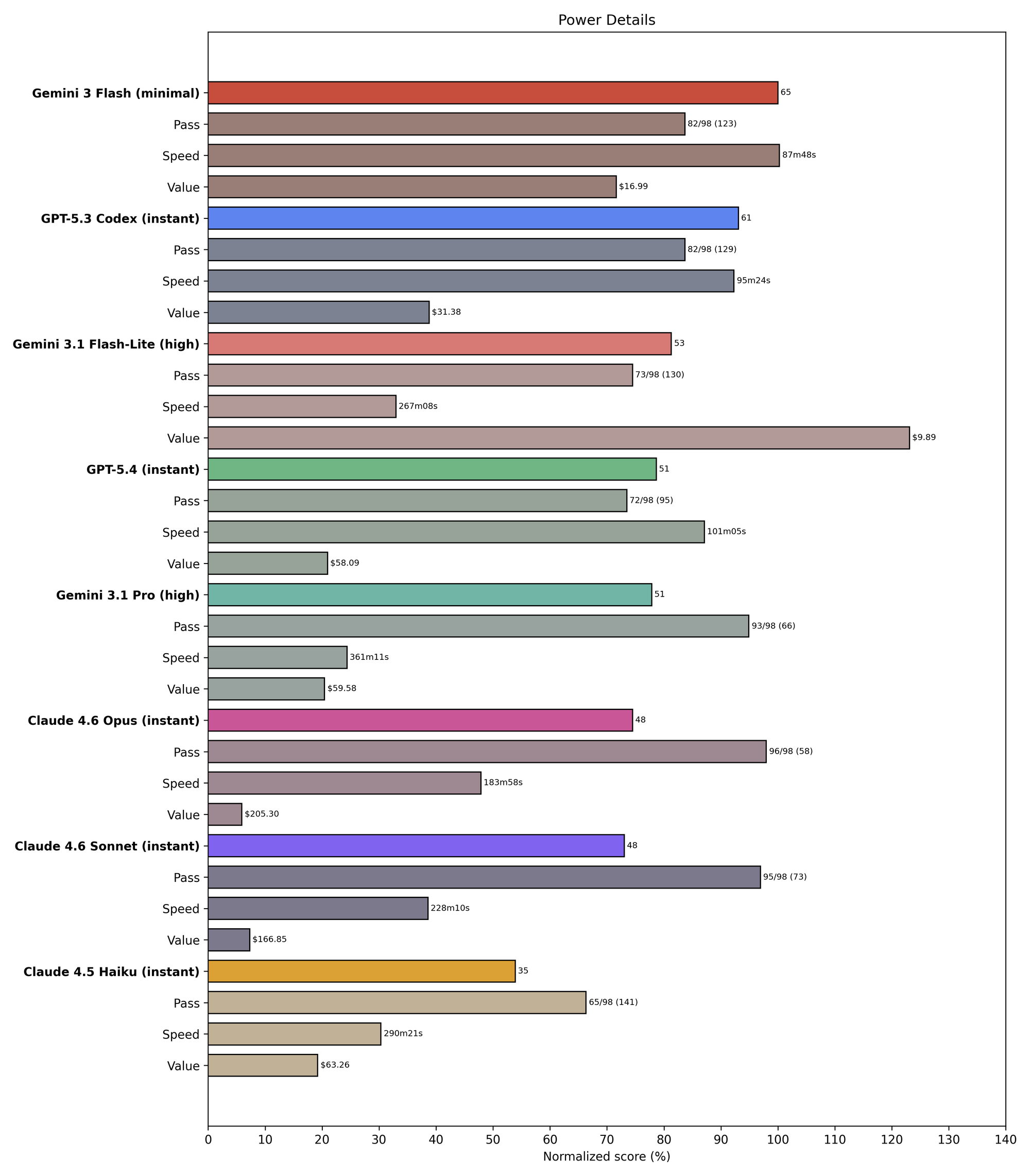
To solve this, we're adding visualizations of Value (inverse cost) and Speed (inverse latency), as well as Power (a weighted geometric mean of Score, Value, and Speed). Here's what this looks like for the strongest February finalist models, as well as the recently-released GPT 5.4, Codex 5.3, and Flash 3.1 Lite:
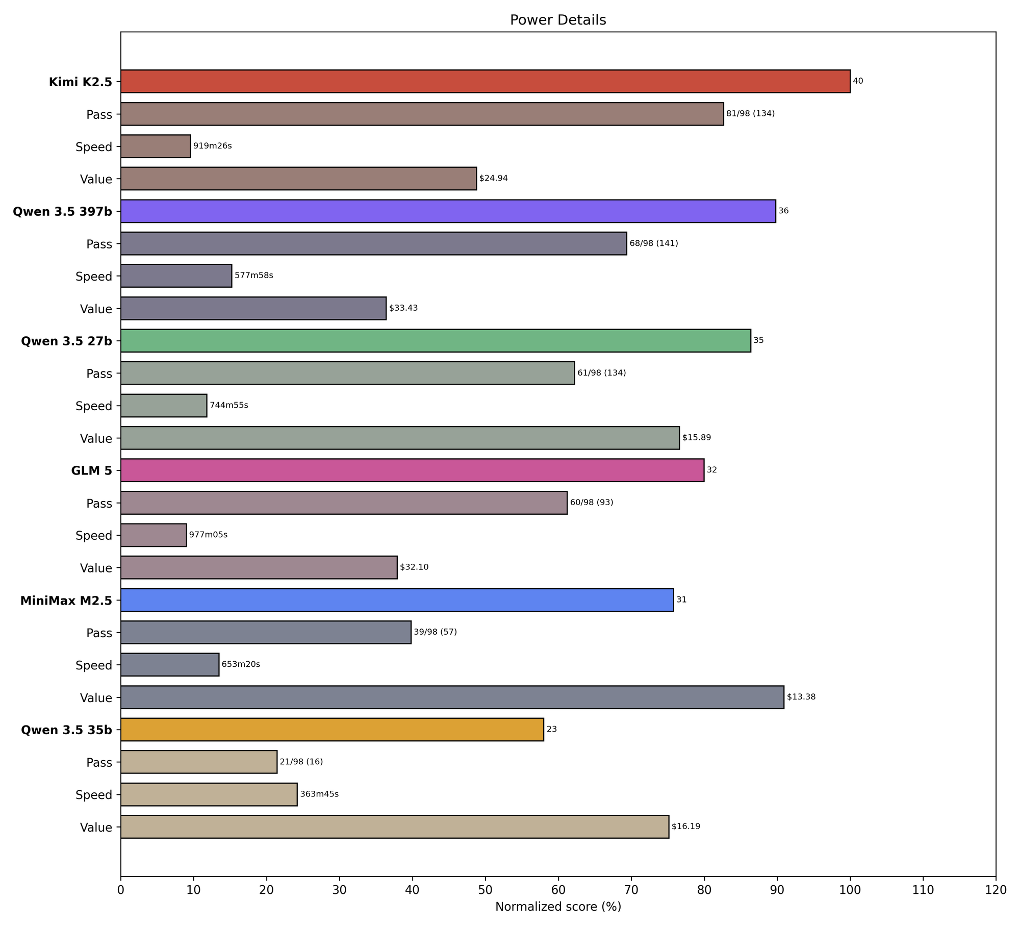
And here are the open-weights finalists ranked only among themselves. (They are all over 3x slower than the fastest model above, so renormalizing helps decompress the results.)
Finally, here's just the power metric for all the tested finalists:
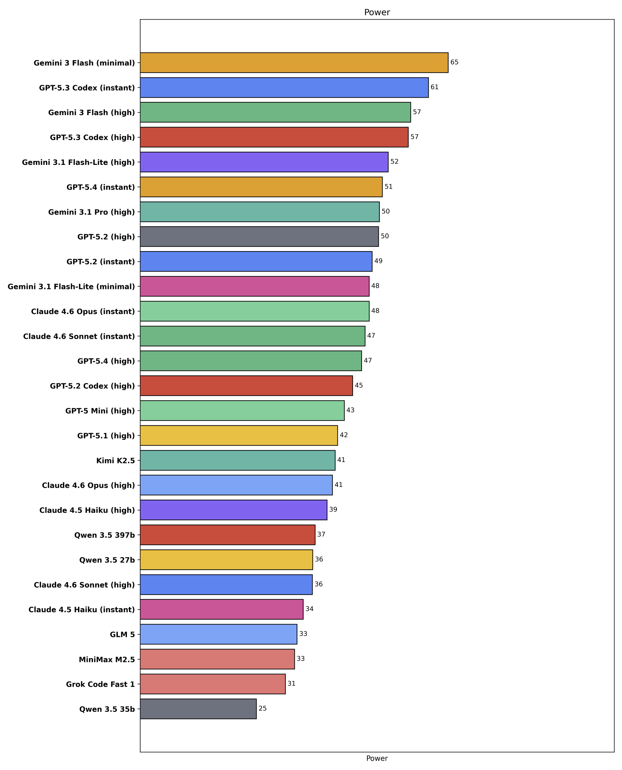
Visualized this way, some of the points from our original writeup become more clear; in particular, speed is the main obstacle holding back the open weights models, while price is the main challenge for Anthropic.